Sunday, August 22, 2010

I HAVE MOVED!

I have moved this blog to Wordpress. You can find the new site here:

http://thelyingtruthofarchitecture.wordpress.com/

There will be no new updates to this website. I think Wordpress is a more appropriate forum for my type of blog. Plus, after having this blog on Blogger for almost a year, I just now realize that I spelled the word architecture wrong in my web address!! Whoops! (Insert: blushing cheeks)

Friday, August 6, 2010

Old in the New: The Innovation/Tradition Duality of Le Corbusier

Vitruvian Man Vs. Modern Man (Da Vinci and Le Corbusier)

The common story about Modern architecture was that it was a complete break from the past. Certain new avant-garde art movements combined with new ways of building created the emergence of a new aesthetic that emphasized a break from tradition. Hardcore Modernists, Futurists, and the De Stilj rejected the past as unnecessary and oppressive, but we see that the master architects of the modern era still retained links and connections to the past in subtle ways. They also looked back further for their inspiration. Some architects became interested in the idea of the primal building; the building that would link us to the essence of ancient mankind. This primitivism was an attempt to find a deeper truth about architecture instead of the shallow and blind reuse of traditional classical symbolism.

Le Corbusier can be thought of as the godfather of modernist vocabulary. He is a perfect example of the way that buildings could be made in an era of new technology and ideology. His five points of architecture were a brand new rulebook for design. But if one takes a closer look at his work and reads a little in his most revolutionary book, Towards a New Architecture, one cans see clear and strong links to the traditions of architecture. Le Corbusier learned many lessons from ancient architecture and he incorporated these into his revolutionary new synthesis.


La Tourette by Le Corbusier. A fount of geometry.

Geometry of the ancients:

Le Corbusier spoke of a lesson to be learned from Rome. The lesson, according to Towards A New Architecture is basically that the vocabulary of Ancient Roman architecture used pure geometric shapes to create bold buildings. The use of geometry that is unfussy and done in an ordered unified way created a rhetoric of power. It also defied and conquered the chaos of nature. Le Corbusier argued that the use of these simple geometries expressed the “pure and simple beauty of architecture.” This lesson is so fundamental that it can easily be translated into the Modernist architectural idiom without specifically evoking Roman precedents. The pure geometries found in the Villa Savoy or La Tourette exude the same bold power of Roman precedents without being derivative of them. One would never mistake the Villa Savoy as Neo-Roman! The duality is that the buildings are taking inspiration from ancient architecture while simultaneously being unprecedented and revolutionary.

Lines of Notre Dame from Towards a New Architecture by Le Corbusier.

Villas La Roche-Jeanneret by Le Corbusier with regulating lines.

Regulating Lines:

Le Corbusier expounded on regulating lines his whole career. He believed that a proportional system placed on the facades of his buildings would create aesthetically beautiful results. By studying major works throughout history including Notre Dame Cathedral, Petite Trianon and the Campidoglio, Corbusier was able to discern proportional regulating factors that sought to create a more wholly unified facade. He subsequently took these systems and applied them to the facades of his ultra Modernist villas. Once again, he takes a fundamental basic lesson from history and translates it onto his revolutionary work. He has found a way to use the past without being imitative.

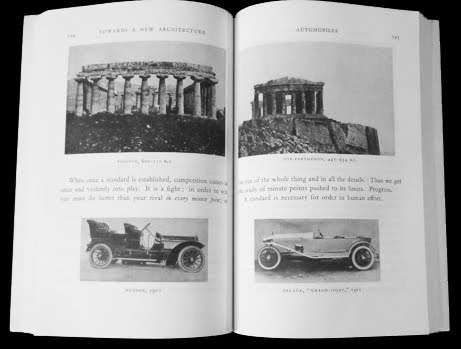
Dualities right on the page!! The Standard.

Le Corbusier used a standard of proportion and construction to create the Heidi Weber Pavilion.

The Standard:

The chapter in Towards a New Architecture about the goal of creating a standard is the most obvious and intriguing duality found in the book. Here Le Corbusier compares the evolution of the Greek Temple with the evolution of the car. He argues that both of these developing systems were leading towards a perfect standard. This means he believed that through constant improvement and refinement the automobile would reach it’s perfect state in a similar fashion that the Greek Temples reached perfection with the Parthenon. Nothing in the history of architecture is more fascinating than looking at the Greek Temples in chronological order and literally seeing mistakes rectified and proportions refined. He believed the same process was happening with the development of the car and that someday it would reach perfection. When this happened perhaps all cars would look and operate the same. This is largely true, but as we have seen cars are constantly changing due to the needs of the consumer to constantly have something new even though the basic technology of the car changes little. Le Corbusier argued that architecture needed to relearn the concept of refining the standard. He lived in a time of fierce blind tradition and stubborn nostalgia. Architecture needed to break away from this and forge a new way. Ironically ancient precedents inspired the new standard that Corbusier proposed. Once again we see that Le Corbusiers’ revolutionary new way of making architecture was fundamentally grounded on lessons he learned from the past. Great works of art are steeped in precedent. This gives them their subconscious potency.

I feel that the standard is something that most young architects are not interested in any more. They believe that every building should be something new and fresh. The concept of deriving ideas from a project before it seems uninspired or unoriginal. But we should be constantly learning from our past to make each building better. If this is done with diligence, I think eventually all works by a certain architect will begin to look the same, at least on a superficial level. I view this as a positive. Once an architect has reached this plateau they are no longer innovating, but refining. This is where perfection can be reached. This is the creation of the standard. Mies Van Der Rohe got to this point in his late career and Renzo Piano is there right now.

Pure geometries, regulating lines and the goal of the standard all work together to create architecture of rhythm and harmony. The fundamental qualities of architecture are retained but used in new ways. Architecture evolves and adapts. Le Corbusier is teaching us that the wheel should never be reinvented; it should just be reinterpreted through the means and constraints of our time.

For the next post I will explore how other modern architects reconciled the duality between forging a new way of building while utilizing the past.

Mies Van Der Rohe achieved a standard. Chicago Federal Center. (Photo by Argitect)

Thursday, July 8, 2010

Commodity and Delight.


The lovable George Carlin.

George Carlin has a hilarious standup routine where he takes the Ten Commandments and distills them into two. It got me thinking about the holy trinity of architecture by Vitruvius: commodity, firmness and delight. Now, really when you think about it, commodity and firmness basically speak of the same thing. They are both dealing with pragmatic concerns. Commodity includes the logical development of program, economy, and integrated systems within the building. Firmness deals with the structural soundness of the building. These are both logical and necessary concerns. A truly successful building should operate efficiently, economically and structurally. So in the tradition of George Carlin I propose we combine these two rules into the all encompassing word of Commodity. Commodity is a much broader word than firmness. It’s a definition that can successfully imply structural integrity.

Delight speaks of the aesthetic will of the architect. It talks of the more intangible practice of creating beauty. Delight is the effort by the architect to integrate all the pragmatic concerns into a visual language that has rhythm and harmony. This is elusive, indefinable, and (removed of context) seemingly arbitrary. Therefore the rule known as Delight could not possibly be combined with Commodity because they do not share similar motivations.

Too much Delight? Frank Gehry.
The impossibility of artistic bias. Walter Gropius House.

Some of the so called Functionalists of the early twentieth century would argue that a building created in perfect commodity would be by it’s very nature delightful. They would say that aesthetic concerns are outcroppings of logical building. If a true pragmatic functionalist were writing this article right now he/she could go further than me. He or she could pair down the Vitruvian triad to only one rule: Commodity. I love the functionalist ideology, and I believe in it as well, but I also acknowledge that it is next to impossible to be completely impartial when designing a building. The aesthetic will of the architect will present itself no matter how hard one tries to repress it. What is fascinating about the Functionalists is that their aesthetic vocabulary (which they think they didn’t have) is actually a creation of functionalist symbolism. Only in hindsight do visual cues begin to emerge in these harsh buildings that attempt to be free of rhetoric and artistic will. Still, I think it is a noble direction to strive in. I believe in the power and posterity of the universal over the individual.

Robert Venturi's diagram of the Functionalist Vitruvian method. (From Learning from Las Vegas).

So, discounting the Functionalists, there are two basic tenets of architecture; Commodity and Delight. The architect must walk a tightrope between aesthetic and pragmatic concerns. This is the dual nature of the architect. By our very nature we are conflicted individuals. We are unsatisfied with total logic. We are unsatisfied with the complete freedom awarded to the fine artist. We are hypocrites towards our own desires. Long live the dual natured architect!

Now for some comedy: http://www.youtube.com/watch?v=YzEs2nj7iZM

Monday, July 5, 2010

Visit to Greensburg

Progress is born of devastation. Greensburg right after the tornado.

A city reborn. (Photo by Argitect)

Opening note: I am generally averse to using the phrases Green and Sustainable simply because they have lost their meaning with overuse. I will use them here ,however, in the absence of being able to think of elaborate replacements.

The Great Conflagration of Chicago in 1871 was a catalyzing event for architecture. The means and methods for a new way of building were already in place but the urgency was not there. Overnight, the fire leveled the entire metropolitan area of Chicago creating open real estate in a big city. The American spirit of perseverance called for immediate rebuilding of the town. The rising cost of land and the increase in population meant that the town could not be rebuilt the same as it once was. Architects exploited the new industrial technology to meet new demands, and the skyscraper was born. The means and methods for the epoch shift in building were already in place but the fire was the catalyzing event that created the urgency for a new way of building.

Over this past weekend I visited a good friend in Greensburg, Kansas. In May of 2007 an F5 tornado leveled almost 95 percent of the small town killing eleven people. The never-ending American spirit of perseverance called for an immediate end to mourning and a swift rebuilding. I have a romantic vision of the leaders of the town huddled tightly around a table in a FEMA trailer with fingers on a map of Greensburg. In that humid and cramped meeting the idea came to not only rebuild the town, but to make it new. They decided to make Greensburg a green town. In other words, they would rebuild their great little town not as a duplication of what it once was, but as an entirely new and unprecedented city of buildings made in a way that are responsible and caring towards the earth. This is an amazing feat considering that the town mostly consists of staunch conservatives that believe in tradition. But, whether you are liberal or conservative the means for creating green buildings is not only the responsible thing to do, it is cost saving in the long run and will last longer. It is the logical solution.

Greensburg City Hall. (Photo by Argitect)
The Stunning new museum in Greensburg. (Photo by Argitect.)

Well, I’m here visiting in 2010 and there is a large handful of important new buildings built to exacting standards for the maximum in responsible earth conscious design. There is a wind farm that supplies the power to the city. There is a water collection system on Main Street that collects the water for a cistern. On Main Street there is an incubator business building, a couple new banks, and the new City Hall all built to LEED standards. The city hall is the star of Main Street. It is the first LEED Platinum city hall in the entire United States and utilizes solar and geothermal heating. In true phoenix fashion the building is partially clad in bricks recovered from the rubble of the tornado. This is a potent symbol for the brave new town bouncing back from devastation. Nearby is a new LEED Platinum museum designed and built by students at the University of Kansas. The building is stunningly modern, clad mostly in recovered wood that is faced in clear glass panels. It is shocking to see such interesting and fearless modern architecture in such a conservative rural setting. There are no alleviating vernacular features to soften the boldness of this project. It is the best example of the bold new spirit of the town. You just don’t find buildings like this in towns with populations less than 1000!

The Silo Eco Home. (Photo by Argitect)

The hub for all this green activity is found at the Silo Eco-Home, which is the office for Greentown. This is where my friend works. This is the window for visitors to the town. They give tours and show off building products that are environmentally conscious. The best example for the movement however is the house itself, the first in a chain of a proposed handful of case studies meant to showcase possibilities for economical green home building. It has a solar panel for electricity, a green roof, a water run-off garden, a permeable driveway, composite recycled countertops, rapidly renewable bamboo floors, super efficient toilets, and many other features. It also reminds us that the best way to be green is to reuse materials. The railings on the stairway are made of discarded farm machinery parts. The kitchen was designed around some cabinet doors that were recovered from a dilapidated house right outside of town.

Besides being green, another requirement for the new buildings in town is that they must be tornado proof. Regionalism in architecture is influenced not only by climate and local materials, but by what kinds of disasters are prevalent in the area. Had Greensburg been the result of an earthquake or a flood, the new buildings would have been built differently.

After spending several days in Greensburg it really sunk in how truly amazing and unlikely all this was. A small town struck down by the worst of tornadoes rebuilds with bravery, open mindedness and an eye to the future. The communities around Greensburg are dying fast. The small towns once sustained by agriculture are now surrounded by corporate farms that have taken the local livelihood away. Wilmore is a nearby town that is on the abyss. The residents are all elderly and it is doubtful their homes will be occupied after they pass on. The town will live out the span of its residents and that’s it. Greensburg Greentown has the tenacity and perseverant spirit to overcome this fate by adopting a progressive new way of building. Not only is it responsible building, it is a tourist attraction and a magnet for new residents interested in living in a new kind of town. This is one of the most amazing examples ever of the adage; “Every cloud has a silver lining.”

The means and methods for a new greener way of building have slowly emerged in the last forty years. It is only in the last ten years that a catalyzing event has signaled an epoch shift in the way we build. We finally have an urgency to build this way. The tornado in Greensburg is a reminder and model for how a new town can be built in a responsible manner. The members of the Greentown initiative also acknowledge that these methods can and should be implemented in all cities in already existing buildings. The best way to be green is to reuse existing structures and retrofit them with new methods of operation. Now, obviously Greensburg is not Chicago. The epoch shift here is much more subtle. We still live in an industrial age, but the circumstances and motives for building have fundamentally changed. The recent never ending oil spill is yet one more shot fired in the call for a better, more responsible future. This future lies with a humbler humanity.

The beautiful new Greensburg School. (Photo by Argitect)

Thursday, June 3, 2010

The Antipodes of Post Modernism


The Quiet Sinking of a Little Ship (Original collage by Stanley Tigerman, new collage with a Stanley Tigerman building in it by Argitect.)

“A feeling for paradox allows seemingly dissimilar things to exist side by side, their very incongruity suggesting a kind of truth.”- August Heckscher (as quoted in Complexity and Contradiction in Architecture.)

Post-Modernism is a period in architectural history we would just like to forget. It’s like looking at an old photograph of yourself and saying “OH god my hair, and what was I wearing.” Architecture will always be reactionary, and by the seventies the modern movement had grown stale. All the master architects that produced the modern movement were dead and the second wave didn’t have the finesse to keep modernism sophisticated. So, inevitably rebellion ensued. Venturi declared that less is actually a bore. Tigerman sunk the Titanic (Crown Hall) The shots were fired. But, what beautiful writing these Post-Modernists had. Complexity and Contradiction has to be one of my all time favorite books on architecture ever. It is vital! One of the biggest shocks comes at the end when you actually get to see examples of Venturi’s work. I scratched my head and thought to myself; “He wrote so beautifully, and this is his solution to architecture?” Needless to say, Venturi’s inclusive, contextual, symbolic architecture has most definitely not stood the test of time. Perhaps it was not meant to. Perhaps it was meant to be a placeholder in the evolution of architecture. Such fleeting architecture will always rub me the wrong way because the very essence of architecture is posterity. A building will live longer than it’s inhabitants, it will live for a long long time. With architecture it is always a bad idea to use trends because future users will hate it so much they will want to tear it down before it’s time. How many skyscrapers in Chicago are so ugly now that we would just like to see them go? Unfortunately, these buildings are much younger than ones by Sullivan, Burnham, Wright, and Mies. These post-Modern buildings with their bright colors, mirrored glass and suggestive forms are so abhorrent to us now we almost don’t see them as contributions to architectural history.

So where is the duality in Post-Modernism? The duality lies primarily in the two major branches of architectural expression found in the period of PoMo. One branch is characterized by a bloated symbolism that reintroduces classical and symbolic elements, which I’ll call Classical Post-Modernism. The other branch is a bold exaggeration of the functional systems in modern building. This is known as High-Tech Modernism. The common factor for both of these branches is theatrical exaggeration. The subtlety and minimalism of high-Modernism is replaced by camp and excess in both strands of Post-Modernism.

Philip Johnson and his AT&T Building. A long long way from the glass house.

Portland Building by Michael Graves. It is impossible to show his buildings in Black and White.

The Classical Post-Modernists sought to incorporate the idea of image back into architecture. Their solution was to take elements from classical architecture previously shunned as irrelevant by the Modernists and reintroduce them in wildly oversized fashion. These symbols were recontextualized, just like the large pop art of Claus Oldenburg, to give society some kind of historical linear connection. The first shot fired in this direction that got major headlines was the AT&T Tower by, of all people, Phillip Johnson. The building is obviously less about glass and more about solidity. Most noticeably though is the use of very large exaggerated classical symbolism. The top is capped with an enormous ridiculous looking broken pediment. This is what led critics to call it a giant Chippendale furniture piece. The entrance is a large Renaissance looking arch. We see architecture that is willfully playful and unfunctional. Amazingly the AT&T tower has stood up over time better than most of its contemporaries mainly because of it’s fine proportioning and homogeneous use of muted color. Michael Graves now notorious Portland Building of 1983 was once a famous example of the Post-Modern counterpoint to the minimalist glass box. It is dolled up in fake ribbons and giant keystones. Its proportions are almost a complete square. But it is building on the most superficial level. It has nothing to do with Classicism, it has nothing to do with regionalism or context; it is merely reactionary. As one character in Woody Allens’ Bergmanesque drama Interiors said, it is “Form without Content.” This building is symptomatic of the extreme cases of Post-Modernism that plagued the eighties. Unfortunately for us this Post-Modern temperament happened at a time of great financial prosperity so there is a lot of this stuff in the skylines all over America. The wealthy clients also liked this Po-Mo posturing because the ties with tradition seemed to bolster their conservative nature. It is similar to Pop Art in the sense that it appealed to the masses even if they didn’t understand it’s meaning. The surface was loud, glossy, unsubtle and the message was irrelevant to the client. Classicist Post-Modernism is case of pure aesthetics run amok.


Centre Pompidou by Richard Rogers. The canonization of utility.

Lloyd's of London-Richard Rogers

High-Tech Post Modernism is the antipode. It is a case of pure functionalism run amok. Whereas the Classicists PoMos aggrandized empty symbolism, the high tech designers took the systems of building and exploited their appearance. Ductwork was no longer hidden or marginalized. It was made huge for effect, painted bright colors, and given a reverent location. Cables strung everywhere. Trusses criss-crossed all over the place. All of the “unsightly” aspects of architecture the Modernists were trying to minimize and hide were embraced by the High Tech movement. This is just another example of the exaggerated nature of architecture in reaction against the rationality of minimalist Modernism. The most famous example (the yin to AT&T’s yang) of this high tech PoMo is the Pompidou Center by Richard Rogers and Partners. Mechanical and structural systems are exposed in such a pronounced way it appears as if the building is inside out. Ducts are painted bright colors, the shear bracing cables are spider webbed across the facade, and the escalator is enclosed in a glass tube, giving it the appearance also of a mechanical utility. Essentially the same story is found at the Lloyd’s of London Building, by Richard Rogers, which also looks inside out. Staircases are shiny corkscrews and ducts seem to snake in every direction, it looks like it belongs in a Terry Gilliam movie. The famous Hong Kong bank by Norman Foster also takes this idea of inside out architecture and literally puts the building cores on the perimeter. This allows a glazed open cavity in the middle. The building is held up with complex structural acrobatics that resemble stacked suspension bridges.

Norman Foster and Partners. Hong Kong Bank. An inside-out building.

The problem I find with High Tech architecture is it’s extreme loudness. It has no subtlety of expression; it is busy and makes one nervous. It has a dystopian nature. Why would anyone want that? The problem I find with Classical Post Modernism is it’s extreme transitory nature. It’s appeal lasts maybe five years, however it’s existence is perhaps a hundred. The reaction against modernism was a reaction against the subtle refinement of post industrial, non-regional, non-symbolic building. Unfortunately this reaction did not have posterity on its side. It was a necessary step in the evolution of architecture and some of its lessons still dominate architectural practice such as an interest in context and region.

One last note: I am not suggesting here that Post Modernism only consisted of two very opposite styles. The very nature of the Post Modern era was pluralism. Each individual architect approached the question of what to do after the Modern era in differing ways. The ones I discuss here are just the extremes in the antipodes of thought. Someone like Helmut Jahn arguably combined the high tech look with symbolic classicism in some of his eighties work. But that is for another post.

Friday, May 7, 2010

The Duality of Density


Le Corbusier: Chandigargh. Superimposed Independence.

It’s a given today that most buildings have open airy public spaces. In these buildings, the private functionally dense spaces such as bathrooms, utility rooms and vertical transportation tend to be clustered into private dense cores. These contrast greatly with the open, usually light filled and glazed open spaces that contain the more ambiguous function of human interaction and use. The cores are function concentrated, the public spaces, even though they may be given the titled function of (for example) lobby, or reception hall, contain within a freer nature in regard to their functions. If this is ubiquitous and happens in most modern buildings I could name off any number of arbitrary examples to describe this duality of density , but I will look at something else: This density duality becomes interesting when the architect acknowledges and aggrandizes this contrast for effect. The super functional dense space is then balanced with the freer space creating a tension between; opacity/transparency, density/openness, and strict functionality/organic functionality.

Le Corbusier: Domino Structural System.

The Industrial Revolution allowed for column and beam design to span much greater distances. When architects such as Le Corbusier finally embraced this we suddenly see a distilled separation between building functions that were once contained in unity. The Domino column system Le Corbusier developed finally allowed walls the freedom from structurally bearing loads. This allowed freedom of placement and materiality. Inevitably this led to the ubiquitous use of glass facades in public rooms. By necessity this forced more private and unsightly functioning rooms such as bathrooms to remain opaque and concealed. Le Corbusier may have brought the Domino system to the modern world but he didn’t utilize the freedom it garnered as much as his contemporaries in the 1920s. Le Corbusier, even after the Domino system, continued to create sculptural form driven buildings that held up ambiguities in functional density. He does do it, but not as clearly as Mies Van Der Rohe would. The Villa Savoye plays with programmatic and structural contrast but packages it in an ambiguous fashion. The elements are less distilled. The House of Parliament in Chandigargh India built in 1961 demonstrates a clear separation between the rigid structural grid matrix and a free plan. Stairs, bathrooms and the parliament assembly hall float in allotted spaces not determined by the grid. Structure and function operate in superimposed independence.

MVDR: Chicago Federal Center Lobby.

Mies Van Der Rohe took the distillation of function and density and perfected it. The pinnacle of dual density can be found in his glass skyscrapers. The Chicago Federal Center is a perfect example of his skyscraper archetype. The lobby is the best place to start because the public part has an ambiguous functionality. In other words, function in a lobby is liquid, it changes periodically and adapts to certain uses, whether it be asking for information at a kiosk, getting coffee or waiting for a rendezvous. The lobby is glazed and open, columns are minimized in order to allow as free and indeterminate space as possible. In bold contrast to this are the hyper functional cores, opaque, clad in granite, containing elevators, stairs, and other mechanical utilities. Openings are minimized. It is meant strictly as a solid element. The ground and cores are clad in the same material to reinforce this solidity. The duality is uncompromising: when in the open lobby we are confronted with giant monoliths of functionality. A lesser architect would have broken up the severity of the contrast, even added clerestory windows in the bathrooms! But Mies does not, he chooses to exploit the contrast completely. Mies may have not been the first one to have a skyscraper with a core, but he was the first to completely distill the core from the rest of the building in such a complete way. Almost all architects after him copied this skyscraper archetype to such a degree it is hard to appreciate the original.

MVDR: Crown Hall Section Showing Sectional Density.

The basement into Crown Hall. Oooh ominous.

Mies utilized this core distillation in several of his other notable “Pavilion” type buildings. With the pavilion type he began distilling function by levels. Crown Hall and the Berlin National Gallery are both essentially dense opaque plinths full of function topped off by glass pavilions completely open, uninterrupted and functionally liquid. To further the freedom of the space he relegates the structural supports to the outside allowing for almost no interruptions whatsoever in the pavilions. Visiting Crown Hall it is jarring to descend the open stairs of the glass pavilion and arrive in a dark concrete block hallway with minimal light. It’s like walking into a completely different building, one that is certainly more conventional. Mies put the serious constraining business of his buildings in these plinths allowing the space above an uncluttered haven for creative thought and open dialogue.

Johnson's Glass House Plan.

Philip Johnson Glass House arguably demonstrates this dual density more successfully than the Farnsworth House. In Johnson’s House the core is asymmetrically placed, cylindrical and clad in brick, just like the floor. The fireplace in the core grounds it further. It is the anchor and the glass house seems pinned down by it. The tension is marvelous between the shape, the materiality and the completeness of the opacity versus the transparent walls. The ceiling, which is also opaque is not embraced by the core and floor, but instead seems to float by using the simple trick of cladding it in white plaster. Had it been a darker color or clad in brick the house would have taken on too much of a severity, the contrast would have remained ambiguous. Now that I think about this, the rule of floating ceiling and grounded floor seem to be almost universal in mid-century minimalism. I will explore this in another post.

Kahn: Richards Medical Research. Density chimneys.

Many of you may be thinking by now that Louis Kahn has already expressed this duality when he spoke of his servant and served spaces, and yes I agree with you. Louis Kahn exploited contrast when it came to functionality. His architecture is bold and unambiguous in this way. Richards Medical Research Laboratory at the University of Pennsylvania is an early and great example of dual density. The labs are comprised of autonomous squares connected by transitional hallways. The squares are glazed and uninterrupted by structural supports. The function is liquid; the scientists are free to conduct their business. The functionally dense portions of the lab are relegated to core elements attached on the center perimeters. These functionally dense spaces are appropriately opaque, being clad in brick. They also have a vertical thrust that contrasts with the horizontal stacking of floors. One small criticism: Had Kahn used brick exclusively in the vertical core elements instead of using brick accents on the facade the contrast would have been better distilled. The brick on the facade is used to articulate structure versus infill, but some slight difference in hue or materiality in contrast to what is used in the cores might help. (I’m not arrogant enough to suggest that Louis Kahn got it wrong, the building is stunning as is, and his dedication to his craft leads me to believe he exhausted every possibility before deciding on the final solution of this building.)

Kahn: Salk Court. Is there a more perfect space?

The Salk Institute is another strong example by Louis Kahn of this functionally dual density. In this building we find a complete distillation between freedom and density. The stairs, elevators bathrooms and utilities are relegated to opaque core elements clad in concrete. These cores, in rhythmic ribbons, are offset by completely open laboratory floors where Scientists are unhindered in their pursuits. Taking this distillation to the next level, Kahn relegated all mechanical and structural systems in the interstitial floors between the laboratories. So basically, a lab is found on every other floor with a utility floor sandwiched between them. Similar to what Mies did with his pavilion buildings, functional distillation is remedied in section. Kahn addresses the dual density once more with the dramatic courtyard. The courtyard separates the building in two. It is open in every way, its function is completely liquid, in fact it has a fountain that embraces the coastline in the distance. It is a place of repose, reflection and escape in contrast to the heavy task of work. Louis Kahn acknowledged, embraced and exploited the myriad dualities found in architecture. He was truly a genius.

Many more examples come to mind of this duality of density, most notably the Lloyd’s of London Building whose drill bit stairwells contrast with glass floors, albeit the building is so busy with high-tech clutter the distillation is not entirely clear. The master architect, when dealing with functions that vary wildly, is able to tease a distilled clarity from the complex and confusing realm of architecture.


Lloyd's of London. Busy Business.

Monday, April 26, 2010

Delayed

Sorry for the delay in blog posts, I am between addresses. I have one in the works right now about the duality of density that should be up shortly.